Introduction
In the world of data analysis, visual representation plays a crucial role in understanding complex information. Among the various tools available for data visualization, the strip chart stands out as a powerful and versatile option. This simple yet effective graphical representation allows analysts to display individual data points along a single axis, making it easier to identify trends, patterns, and outliers. In this blog, we will explore what strip charts are, how they work, their applications in different fields, and why they are an essential tool for every analyst. Whether you are a seasoned data professional or just starting your analytical journey, understanding strip charts can significantly enhance your ability to convey insights effectively.
What is a Strip Chart?
Definition
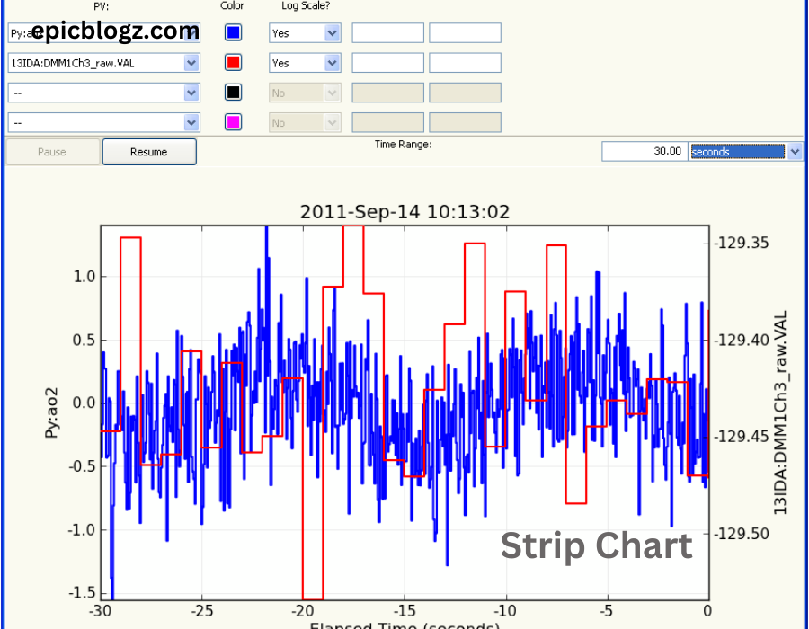
A strip chart, also known as a dot plot or strip plot, is a type of data visualization that displays individual data points along a single axis. Unlike traditional bar charts or histograms that aggregate data into bins or categories, strip charts represent each observation separately. This characteristic allows viewers to see the distribution of values and identify patterns that might be obscured in other chart types.
Structure
Typically, a strip chart consists of two main components:
- Horizontal or Vertical Axis: The axis represents the variable being analyzed. Depending on the orientation of the chart, it can either be horizontal (x-axis) or vertical (y-axis).
- Data Points: Each data point is represented as a dot or marker along the axis. The position of each point corresponds to its value on the variable being measured.
How Strip Charts Work
Data Representation
Strip charts excel at displaying raw data without aggregation. For instance, if you have a dataset containing test scores for a class of students, each score can be plotted as an individual point on the chart. This representation allows analysts to visualize the entire dataset rather than summarizing it into categories.
Handling Overlapping Points
One challenge with strip charts is that multiple data points may overlap at the same value. To address this issue, analysts often employ techniques such as jittering or dodging:
- Jittering: This technique adds random noise to the position of points along the axis, preventing overlap and making it easier to see clusters of data.
- Dodging: In this approach, points are offset slightly from their original position to create space between overlapping values.
Example
Consider a scenario where you want to analyze the heights of individuals in a group. A strip chart can effectively display each person’s height along a single axis, allowing you to see not only the distribution but also any potential outliers (e.g., exceptionally tall or short individuals).
Advantages of Using Strip Charts
1. Clarity and Simplicity
One of the primary advantages of strip charts is their clarity. By representing individual data points without aggregation, analysts can convey information straightforwardly. Viewers can quickly grasp the distribution of values and identify patterns without sifting through complex visualizations.
2. Effective for Small Datasets
Strip charts work exceptionally well for small to moderate-sized datasets. When dealing with limited observations, this visualization method allows analysts to showcase every data point effectively. In contrast, larger datasets may become cluttered and challenging to interpret.
3. Identification of Outliers
Outliers can significantly impact analysis results. Strip charts make it easy to spot these anomalies since each data point is visible on the chart. Analysts can quickly identify values that fall outside the expected range and investigate their significance further.
4. Flexibility in Data Types
Strip charts can accommodate various types of data, including continuous and categorical variables. This versatility makes them suitable for diverse applications across different fields.
Applications of Strip Charts
1. Healthcare Analysis
In healthcare research, strip charts are commonly used to visualize patient outcomes or treatment effects. For example, researchers may use strip charts to compare recovery times for different treatment groups in a clinical trial. By plotting individual recovery times along an axis, they can easily identify trends and variations among patients.
2. Educational Assessment
Educators often utilize strip charts to analyze student performance on assessments. By plotting individual test scores for students in a class, teachers can quickly assess overall performance and identify students who may need additional support.
3. Market Research
In market research, strip charts can help analysts visualize consumer preferences or survey responses. For instance, if researchers conduct a survey on product satisfaction levels among customers, they can use strip charts to display individual ratings clearly.
4. Environmental Studies
Environmental scientists frequently use strip charts to analyze measurements such as temperature readings or pollutant levels over time. By plotting individual readings along an axis, researchers can identify trends in environmental changes and assess potential impacts on ecosystems.
Creating Effective Strip Charts
1. Choose Appropriate Software
To create strip charts effectively, analysts should select suitable software tools that support this type of visualization. Popular options include R (using ggplot2), Python (using Matplotlib), and various business intelligence tools like Tableau or Power BI.
2. Consider Data Size
When deciding whether to use a strip chart, consider the size of your dataset. For small to moderate datasets with clear distributions, strip charts work well; however, larger datasets may require alternative visualizations like box plots or histograms for better clarity.
3. Use Jittering Wisely
If your dataset contains overlapping points, consider applying jittering techniques thoughtfully. While jittering enhances visibility by preventing overlaps, excessive jittering may distort the true distribution of values.
4. Label Axes Clearly
Ensure that both axes are clearly labeled with relevant units and descriptions so viewers understand what they represent—this clarity enhances comprehension when interpreting results from your strip chart.
Limitations of Strip Charts
1. Not Ideal for Large Datasets
While strip charts excel with small datasets, they can become cluttered when dealing with large volumes of data points. In such cases, visualizations like box plots or histograms may provide clearer insights into distributions without overwhelming viewers.
2. Difficulty in Comparing Groups
Strip charts are less effective when comparing multiple groups simultaneously; overlapping points from different groups may obscure meaningful differences between them—this limitation necessitates careful consideration when choosing visualization methods for comparative analyses.
Conclusion
In conclusion, strip charts serve as an invaluable tool for analysts seeking clarity in their data visualizations! Their ability to display individual observations clearly makes them particularly effective for small-to-moderate datasets across various fields—from healthcare analysis and educational assessments to market research and environmental studies! By understanding how strip charts work—alongside their advantages and limitations—analysts can leverage this powerful visualization technique effectively!
FAQs
1. What is a strip chart?
A strip chart, also known as a dot plot or strip plot, is a type of data visualization that displays individual data points along a single axis. Unlike bar charts or histograms that aggregate data into bins, strip charts represent each observation separately, allowing viewers to see the distribution of values and identify patterns.
2. When should I use a strip chart?
Strip charts are best used for small to moderate-sized datasets where you want to display individual observations clearly. They are particularly effective for visualizing distributions, identifying outliers, and showcasing raw data without aggregation. However, they may become cluttered with larger datasets.
3. How do I create a strip chart?
You can create a strip chart using various software tools such as R (with ggplot2), Python (with Matplotlib), or business intelligence tools like Tableau and Power BI. The process typically involves selecting your data, defining the axis for the variable of interest, and plotting individual data points accordingly.
4. What are the advantages of using strip charts?
Strip charts offer several advantages, including clarity and simplicity in displaying individual data points, effective identification of outliers, flexibility in accommodating different types of data, and the ability to visualize raw data without aggregation.
5. Are there any limitations to strip charts?
Yes, strip charts have limitations. They are not ideal for large datasets due to potential clutter and difficulty in interpreting overlapping points. Additionally, they may be less effective for comparing multiple groups simultaneously, as overlapping points can obscure meaningful differences between them.


