Introduction
Tip screens are everywhere—from restaurant checkouts to rideshare apps and even donation pages. These screens provide users with an opportunity to leave a tip, show appreciation, or give feedback. But how often do users actually engage with them? Well, it all comes down to design. Effective tip screens go beyond asking for a tip—they encourage interaction, make the process seamless, and feel more like a natural part of the user experience rather than an afterthought. Whether you’re a business owner, a freelancer, or a designer creating a platform, optimizing your tip screens can significantly increase user engagement and satisfaction.
What Are Tip Screens?
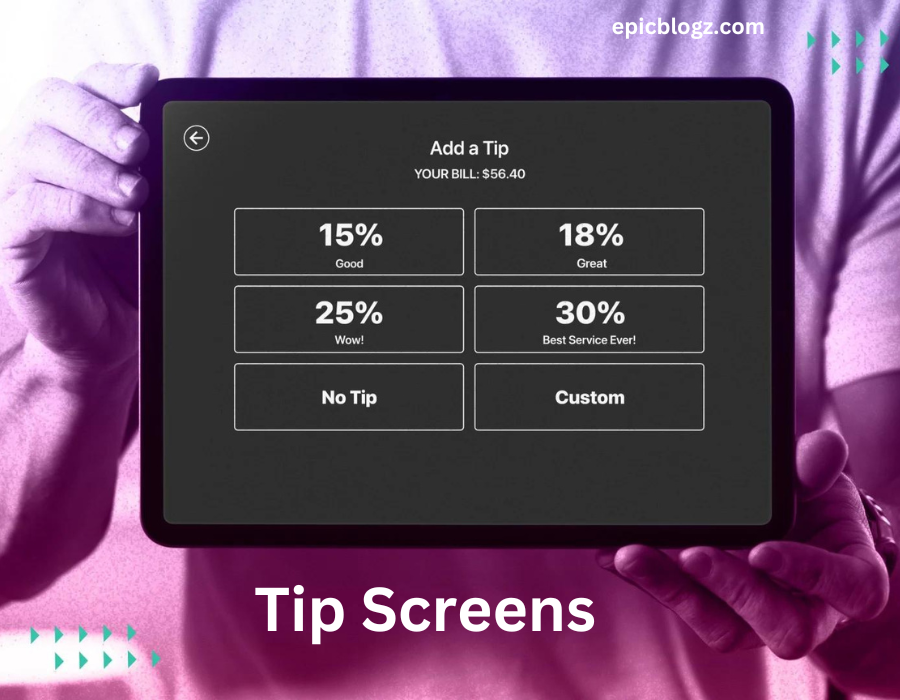
Tip screens are digital prompts that give users the option to leave a gratuity or show appreciation, often after completing a transaction or service. These screens are commonly used in:
- Payment systems (restaurants, coffee shops, bars)
- Rideshare apps (Uber, Lyft)
- Delivery services (food and parcel deliveries)
- Freelance platforms (graphic design, online consultations)
- Donation platforms (charitable causes, crowdfunding)
Despite their ubiquity, tip screens can vary widely in design, functionality, and effectiveness. A poorly designed screen can make users feel uncomfortable or confused, while a well-designed one can make tipping feel natural and even enjoyable.
Why Design Matters for Tip Screens
Design plays a critical role in how users perceive and interact with tip screens. A thoughtfully designed screen can gently nudge users toward tipping, while a cluttered or poorly timed screen can have the opposite effect. The goal is to make tipping easy, intuitive, and even rewarding for the user.
Here’s why design matters:
- Increases Tip Amounts: Simple, engaging designs can encourage higher tips.
- Enhances User Experience: A well-timed, clear prompt adds to the overall user experience.
- Builds Customer Loyalty: When users feel good about their tipping experience, they’re more likely to return.
- Drives Action: Good design removes friction, making users more likely to follow through with a tip.
Let’s explore some effective ways to boost tips through creative and functional tip screen designs.
1. Keep It Simple, Yet Eye-Catching
Simplicity is key when it comes to designing a tip screen. You want the user to know exactly what to do without overthinking. That said, your design should still stand out enough to grab attention.
How to Achieve Simplicity:
- Clear Choices: Offer simple, predefined tip amounts (e.g., 10%, 15%, 20%) along with a custom option. This reduces cognitive load and makes decision-making quicker.
- Minimal Text: Keep text concise and direct. Avoid long sentences or complicated jargon. A simple “Would you like to leave a tip?” is more effective than a lengthy paragraph.
- Visual Focus: Use clean lines, ample white space, and high-contrast colors to ensure the tip options are easy to spot and interact with.
By balancing simplicity with a visually appealing design, you ensure that users feel guided, not overwhelmed.
2. Use Emotional Cues to Engage Users
Effective tip screens often tap into emotions. Gratitude and appreciation are powerful motivators, so why not use them to encourage tipping? Subtle cues like thank-you messages, friendly reminders, or personalization can boost engagement.
Ways to Incorporate Emotional Cues:
- Thank-You Messages: Add a warm, sincere thank-you message before or after the tip prompt. A message like “Thank you for dining with us! Your tip helps support our amazing staff” can humanize the experience.
- Personalization: Mention the user’s name if possible (e.g., “Thank you for your ride, Sarah!”). Personalizing the tip screen can make users feel valued and more likely to tip.
- Positive Reinforcement: Use encouraging language. Instead of a bland “Submit Tip” button, try something more affirmative like “Show Your Appreciation” or “Support the Team.”
These small touches create a positive atmosphere, making the user feel more connected and willing to leave a tip.
3. Optimize for Mobile Devices
With mobile transactions on the rise, tip screens must be optimized for smartphones and tablets. Designing with mobile in mind is essential to ensure users can quickly and comfortably complete their tipping action.
Tips for Mobile Optimization:
- Large Buttons: Make sure the tip buttons are large enough for easy tapping on a touchscreen. Tiny, hard-to-tap buttons can frustrate users and prevent them from leaving a tip.
- Responsive Design: Ensure the tip screen adjusts to different screen sizes and orientations. A responsive layout guarantees that users on any device have a seamless experience.
- Quick Load Times: Mobile users expect quick responses. Make sure your tip screen loads fast and functions smoothly to keep users from abandoning the process.
Mobile optimization is essential in today’s world, where many users expect fast, simple interactions on their phones.
4. Offer Multiple Tip Options
One of the most effective ways to encourage tipping is by giving users a range of tipping options. Offering flexibility makes the user feel more in control of their decision.
Different Ways to Offer Tip Options:
- Percentage-Based Tips: Many tip screens show percentages (10%, 15%, 20%) based on the total transaction amount. This method is familiar and easy for users.
- Custom Tip Amount: Always include a “Custom Tip” option that allows users to input a specific dollar amount. Some users may want to leave more (or less) than the preset options.
- One-Click Tips: For platforms where time is of the essence (like rideshare apps), consider offering one-click tipping. A single tap on a preset amount makes the process quick and effortless.
Providing a variety of tip options shows that you respect the user’s choice, which can increase the likelihood of them leaving a tip.
5. Use Visuals to Encourage Generosity
Humans are visual creatures, and adding compelling images or icons to your tip screen can make a big difference. Graphics or illustrations that symbolize gratitude, service, or generosity can subconsciously encourage users to tip more.
Ideas for Visual Elements:
- Smiley Faces or Thumbs-Up Icons: Positive visuals like happy faces or thumbs-up icons can subtly reinforce the idea that tipping is a positive action.
- Progress Bars: Consider adding a progress bar that shows how much has been tipped so far. Users might feel motivated to contribute more if they see they’re helping reach a goal.
- Tipping Milestones: Showcase tip milestones with a celebratory icon (e.g., “You just helped us hit 100 tips today!”). This encourages users to feel like part of a community effort.
Visuals help create a more engaging and rewarding tipping experience, subtly boosting the chances of users leaving a gratuity.
6. Make It Timely
Timing is everything. Asking for a tip at the right moment can make a world of difference. Tip screens that appear too soon, too late, or in an awkward spot in the user journey can miss the mark. Understanding the perfect timing is crucial for maximizing tips.
Best Moments for Tip Prompts:
- Post-Service: Show the tip screen immediately after the transaction is completed or the service is delivered. Users are more likely to leave a tip when the positive experience is fresh in their minds.
- Receipt Screen: For in-person transactions, displaying the tip screen on the payment receipt (whether digital or physical) is a great way to remind users about tipping without being intrusive.
- Gentle Reminder: If a user skips the initial tip screen, a polite reminder after a few minutes (via push notification or email) can give them a second chance to leave a tip.
By presenting the tip screen at the right time, you’ll avoid coming across as pushy while still encouraging generous tipping.
7. Transparent Communication Builds Trust
Users are more likely to tip when they know exactly where their money is going. Transparency can foster trust, making users feel good about their contribution.
Ways to Communicate Clearly:
- Explain the Impact: Tell users how their tips are used. For example, you can add a line that says, “Tips go directly to the driver” or “Your tip helps support our hardworking team.”
- Break Down the Options: Clarify how much each tipping option represents. For instance, a $2 tip might be labeled “Great Service” while a $5 tip could say “Excellent Service.” This helps users feel more informed about their choice.
- Avoid Guilt-Tripping: Always keep the tone positive. Don’t guilt users into tipping by making them feel bad about choosing not to. Instead, highlight the positive impact of tipping without pressure.
Clear, honest communication makes users more likely to tip because they understand the purpose behind it.
8. Add Incentives for Tipping
Sometimes, a little incentive can go a long way. Offering small rewards for tipping is a great way to boost user engagement and make the process feel more rewarding.
Types of Tipping Incentives:
- Discount on Future Purchases: Offer users a small discount on their next purchase if they leave a tip. For example, “Tip today and get 10% off your next order!” This gives them an immediate benefit for their generosity.
- Exclusive Perks: Offer special perks to those who leave tips, such as early access to new products or services.
- Recognition: Some users enjoy being recognized for their contributions. Consider displaying a “Top Tipper” badge or giving a shout-out to generous users in future interactions.
By adding a fun incentive, you make the tipping process feel less transactional and more rewarding.
Conclusion: Design Tip Screens That Work
Effective tip screens are about more than just asking for a tip—they’re about creating a seamless, engaging, and rewarding experience for the user. By keeping the design simple, incorporating emotional cues, offering multiple tipping options, and being transparent about where the money goes, you can significantly boost user engagement and increase tips.
Remember, designing a tip screen isn’t a one-size-fits-all process. You’ll need to tailor your approach based on your audience, the service you’re offering, and the platform you’re using. But with the right strategies in place, you’ll turn tipping into a natural, feel-good part of the user experience.
ALSO READ: Techdae.frl: Explore the latest gadgets and trends
FAQs
How can I design a tip screen that encourages more tips?
Focus on simplicity, clear tipping options, positive reinforcement, and emotional cues to make tipping feel easy and rewarding for users.
What’s the best time to present a tip screen?
The best time is right after the service or transaction is complete, when the experience is fresh in the user’s mind.
Can visuals improve tipping behavior?
Yes! Positive visuals like smiley faces or icons representing gratitude can subtly encourage users to leave a tip.
Should I offer custom tip options?
Absolutely! Offering both preset and custom tip options gives users the flexibility to tip exactly how much they feel is appropriate.
How can I make tipping feel less transactional?
Adding emotional elements, personal thank-you messages, and even small rewards can make tipping feel more like an act of appreciation than a simple transaction.


